————
UPDATE (2015-07-10): If you just want the WSPs, then they can be downloaded here for 2013.
UPDATE (2013-06-06): A SharePoint 2013 version of this solution is now available! Download it here. The 2010 version is still available for download.
UPDATE: There is a bug in the original code where the modal wait screen does not close properly in IE (when publishing items). It works fine with Chrome however.
I have updated the downloadable code with the fix. This now works with IE and Chrome. I’m pretty sure it works with Firefox also.
————
OOTB in SharePoint 2010 you can bulk approve/reject and unpublish multiple items using the Content and Structure tool (under Site Administration). There are a few problems with this however:
- Obviously this is not intuitive
- There is no bulk publish
- There is no bulk cancel approval
- Bulk approve/reject doesn’t seem to do anything when there is a content approval workflow running on the items (is this happening for you too?)
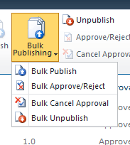
I went ahead and developed a couple of custom Ribbon buttons that allow you to bulk publish, approve/reject, cancel approval and unpublish multiple items. If an approval workflow is defined for the library, these actions start or stop the workflow appropriately.
The user gets a flyout menu as below:

For bulk publish and approve/reject, the user gets an OOTB-looking dialog that lists the selected items as below:

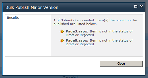
A result screen lists any item that could not be processed and the reason:

1. Download the source code
You can download the complete Visual Studio solution here.
2. Want to further improve the user experience in SharePoint?
Check out my other custom solutions here.
3. Key and interesting points
I did not go into details about the code for this solution because most of it is actually just straightforward SharePoint & ASP.NET. I however have highlighted key and interesting points below.
General approach
The general approach is to extract the ID of the selected items, concatenate them into a delimited string, and then open an application page (in dialog mode) and pass the string as a query string parameter. The ID of the list is also passed to the application page. There is one application page for each of the action (publish, approve/reject, etc) and all of the processing is done in these application pages. When the application page closes, the list is refreshed.
Referencing JavaScript for the buttons
There are 2 CustomAction elements. One defines our custom buttons for the Ribbon, the other adds a reference to our JavaScript to the current page (i.e. the list view). This latter element looks like below. Location=”ScriptLink” is the bit that does the magic.
<CustomAction Id="BulkPublishingRibbonCustomActions.Script"
				  Location="ScriptLink"
				  ScriptSrc="BNH.SharePoint.BulkPublishing/BulkPublishing.js"/>
Enable/disable the buttons
The flyout button (the main one) should be disabled if no items are selected. This is straightforward. The child buttons however should be enabled/disabled depending on the settings of the list. Publish for example should be disabled if minor version is not enabled.
To get the settings of the list we need to make async calls using the SP JavaScript API. To make the EnabledScript for the button works with async however, we need to make use of the OOTB JavaScript method RefreshCommandUI(). This is described in this post: http://www.itidea.nl/index.php/using-async-call-to-enable-a-custom-ribbon-button.
The RefreshCommandUI() method essentially forces all the EnabledScript to be re-evaluated. However, it only seems to do it for the EnabledScript of the main button, not the child buttons. Furthermore, the EnabledScript of the main button is fired when the page loads or when items are selected. The EnabledScript of the child buttons are fired when the main button is clicked, i.e. when the flyout menu actually “flies out”.
The approach I have taken is to make the async calls in the EnabledScript of the main button to gather all the relevant settings and store them into variables. The EnabledScript of the child buttons simply check these variables.
Achieving the OOTB look and feel
If you have ever looked at the OOTB application pages, you’d noticed that special user controls are used to display each section on the page. Below for example is one section.

The two OOTB user controls used to create these sections are wssuc:InputFormSection and wssuc:InputFormControl. These controls are registered on the ASPX page as follow:
<%@ Register TagPrefix="wssuc" TagName="InputFormSection" Src="~/_controltemplates/InputFormSection.ascx" %>
<%@ Register TagPrefix="wssuc" TagName="InputFormControl" Src="~/_controltemplates/InputFormControl.ascx" %>
The below markup demonstrates how to use these controls:
<wssuc:inputformsection id="formSectionCheckInComment" title="This is the bold heading on the left hand side" runat="server">
			<Template_Description>
<asp:Literal runat="server" text="This section is the explanatory text that appears beneath the bold heading on the left hand side."/>
			</Template_Description>
			<Template_InputFormControls>
<!-- This section contains the controls to appear on the right. -->
				<wssuc:InputFormControl LabelText="Label for the particular input field" runat="server">
					<Template_Control>
<!-- Define the control(s) that represent your input field in this section -->
						<textarea id="txtComment" class="ms-long" rows="5" cols="45" title="<%$Resources:wss,checkin_checkincomment_title%>" name="CheckinDescription" runat="server"></textarea>
					</Template_Control>
				</wssuc:InputFormControl>
			</Template_InputFormControls>
		</wssuc:inputformsection>
There is also a special user control for the buttons at the end. This user control is wssuc:ButtonSection. This is registered as:
<%@ Register TagPrefix="wssuc" TagName="ButtonSection" Src="~/_controltemplates/ButtonSection.ascx" %>
This control renders a Cancel button by default (although you can switch this off), which will close the modal dialog if the page is being displayed in dialog mode. This user control can be used as follow:
<wssuc:ButtonSection id="buttonSectionDefault" runat="server">
			<template_buttons>
<!-- Define your additional buttons here. The default Cancel button will be rendered in addition to these. -->
				<asp:Button UseSubmitBehavior="false" runat="server" class="ms-ButtonHeightWidth buttonOK" Text="<%$Resources:wss,multipages_okbutton_text%>" id="btnOK" OnClick="btnOK_Click" accesskey="<%$Resources:wss,okbutton_accesskey%>"/>
			</template_buttons>
		</wssuc:ButtonSection>
There are 2 important things to remember when using these controls:
1. All the form sections should be wrapped in a table tag as follow:
<table class="ms-propertysheet" border="0" width="100%" cellspacing="0" cellpadding="0">
<!-- Form section controls go here -->
</table>
2. Controls in the template sections need to be server controls, i.e. runat=”server”, otherwise they won’t be rendered.
Displaying and closing wait dialog after button post back in dialog mode
When the OK button is clicked (while the page is being displayed in dialog mode) a time consuming operation is launched and I wanted to display a wait dialog. When the post back is completed (i.e. the time consuming operation has finished) I wanted to close the wait dialog but remain on the original page (in dialog mode) to display the result.
I used the OOTB SP.UI.ModalDialog.showWaitScreenWithNoClose() JavaScript method but had some problems closing the wait dialog properly. I solved this in the end and wrote about it here: How to close SharePoint modal wait screen after postBack when page is in dialog mode.
Making the custom buttons available for all libraries
CustomActions typically can be registered against a list template, list URL or content type. I wanted to make these buttons available for the Pages library, document libraries (OOTB and custom templates), master page gallery, etc. The only way this could be achieved is to register the CustomActions with a base content type, such as Document. This is because when the CustomActions are registered against a content type, it will also be displayed for content types inherited (directly or indirectly) from the registered content type.


